Posted September 03, 2021

By Zach Scheidt
How Charts Give You Clues Where A Stock Is Headed
Last week, I asked if you were interested in learning more about stock charts and how they can help you make better investment and trading decisions.
Judging by the responses, it seems like you’re interested!
Over the weekend, my inbox filled up with messages like this one from Tom F.
“Zach and Team, Technical Analysis of charts accompanying your stock recommendations would be fantastic! I am much more focused on understanding (or trying to understand) what charts are telling me for entries and exits on stock positions than I am on fundamentals. Thanks!”
Thanks for the email, Tom! And thanks to everyone who wrote in with similar thoughts.
Today, we'll talk a bit about some of the important clues that charts can give you.
And if there are other things you'd like to hear more about each week — or if you have questions, comments or complaints — please reach out.
I love hearing from you even if it's just to say hello!
Now, let's jump into some charts!
Driving While Looking Through the Rear View Mirror
If there's one complaint that investors have about charts, it's the fact that charts only tell us where a stock has been.
Some people think that using charts for investment decisions is a lot like driving while looking through the rearview mirror.
And that's an important concept to think about.
Charts don't tell us definitively where a stock is going to trade. But the information about where a stock (or an entire market has been) can give us some great clues for what could happen next.
Today, I want to talk about support and resistance areas and how those levels on a chart give us an important "line in the sand" for what to expect from investors.
But before we look at a stock chart, let me tell you a story about one of my former hedge fund clients.
Meet Grumpy Bob, Frustrated With His Underwater Stock
Bob was one of my favorite clients...
Not because he was friendly or fun to be around. Bob was quite grumpy and seemed to always be complaining about something.
I didn't particularly enjoy talking with Bob (even though he called the office often to see how his money was doing).
But I did enjoy hearing his thoughts on specific stocks because he was one of the best contrarian indicators out there!
One summer Bob was particularly ticked off about a blue-chip stock he owned. (I'm changing his name... and I won't tell you which stock it was.)
Every time I saw his number show up on my phone, I would punch up the stock ticker on my terminal before I picked up the receiver. Bob bought the stock earlier in the year and was underwater in his position.
"If only I could get my money back, I'd sell that piece of crap right now!"
That's what Bob would say day after day while waiting for the stock to get back to even.
It took all summer, but eventually, the stock rebounded. And true to his word, Bob sold his position and found a new stock to be enamored with.
Months later when Bob called, I instinctively punched the old stock ticker into my computer. I forgot that Bob had sold the stock and was probably calling about a different company.
What I saw on my computer made me cringe and laugh at the same time.
Bob's stock had doubled since he sold his shares!
I didn't have the heart to tell him. But if he had been a little more patient, he would have made a lot more money!
Instead, he bailed out at a breakeven price and moved his money into a completely different picture.
It's the kind of thing individual investors do time and time again. And it’s the kind of mistake you should avoid if you're going to grow your retirement wealth.
Support and Resistance: The Building Blocks of Stock Charts
Why share this story about Bob?
Because it's a real-life view into the decisions we all make as humans. When we're in an uncomfortable position, we tend to look for a way out. And that's especially true for investors.
Whenever you see a stock chart that has a top (or a series of tops) in one specific area, it tells you one important thing:
Some investors are under water — and probably looking for a way to get their money back.
Take a look at the chart below. This is a picture of the S&P Financial SPDR (XLF) — a fund that tracks the largest U.S. financial stocks.
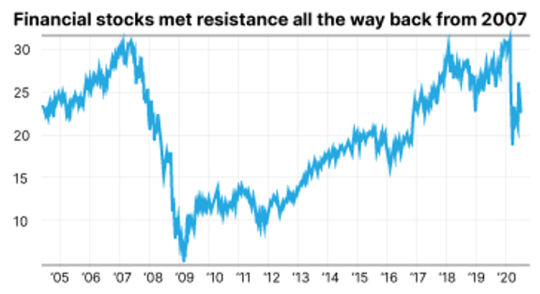
As you can see, the group of stocks topped out when the coronavirus crisis hit and sold off sharply.
The top was almost exactly the same as the top from when the financial crisis hit back in 2007.
Following the panic selloff, financial stocks found their footing, traded in a range for a while and then finally moved back up toward the high (around $32 on the chart).
What happened next?
A bunch of "Grumpy Bob" traders who were stuck in their positions, maybe from just before the coronavirus crisis, or maybe back from the financial crisis finally got back to even.
As these "Grumpy Bob" investors cashed in and sold out of their positions, financial stocks dropped again.
The horizontal line you see at the top of the chart is known as a "resistance level."
It's a spot where investors have been selling because it gives them a chance to get out for breakeven. And the more investors sell at this level, the stronger the resistance level can become!
After all, new buyers who take the stock from investors that are selling become trapped themselves at this new price.
Essentially, this resistance area is a lot like a ceiling or a lid, keeping the stock price from moving any higher because sellers have a motivation to unload positions any time the stock gets close to this level.
When Resistance Is Broken...
I love watching resistance areas for stocks and broad areas of the market. Especially because when resistance areas are broken, exciting things can happen!
Let's think about what happens behind the scenes when a resistance area is broken...
We know that up until this point, investors have decided to sell whenever our stock reaches a specific area. Frustrated investors have thrown in the towel and bailed out of their positions.
Meanwhile, more committed investors have been the ones buying shares when the stock pulls back below the resistance area.
These buyers are likely more committed to holding for the long run because they bought when the stock was lower. (Clearly, they're not just trendy investors buying whatever is hot right now.)
Once a stock breaks above its resistance area, it means there are no more "Grumpy Bob's" left who are trying to get out at break even. All of those weak investors are gone, and the ones left holding shares are now more committed.
So what happens next?
Emotional investors who previously bailed out of their positions now get to watch the stock (or group of stocks) trade higher. And they'll be watching from the sidelines.
If you've ever been in this spot before, watching a stock you used to own move sharply higher, you know exactly how frustrating it can be.
Those sideline investors are typically now the fuel behind the next move higher as they steadily capitulate once again and buy back in.
Here's a picture of what that buying pressure can do!
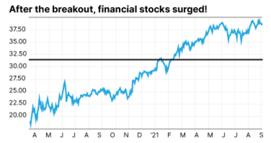
Once the ceiling (or overhead resistance) was broken, shares of financial stocks traded steadily higher!
One other thing to keep in mind is that overhead resistance can become support.
In other words, once the ceiling is broken it can then become a natural place for stocks to rebound if a pullback occurs.
That's because typically the people who missed the breakout are now sitting around wishing they had bought when the market first broke out.
These buyers will naturally step in if they get a second chance. So don't expect that price point that used to be a ceiling to crack any time soon.
We'll talk more about specific chart patterns and how to manage your risk in future installments.
In the meantime please let me know if you found this helpful!
Knowing what charts are telling us about other investors and their buy and sell decisions can make a big difference in determining when to buy and when to sell.
Here's to building your rich retirement!

Zach Scheidt
Editor, Rich Retirement Letter
RichRetirementFeedback@StPaulResearch.com

How Others’ Incompetence Costs You Big-Time
Posted January 17, 2024
By Byron King

Turning Empty Cubicles Into Houses
Posted January 15, 2024
By Zach Scheidt

"Boring AI": Overlooked Opportunity From CES 2024
Posted January 12, 2024
By Zach Scheidt

5 Must-See Predictions
Posted January 10, 2024
By James Altucher

Welcome to Earth, the Mining Planet
Posted January 08, 2024
By Byron King