Posted September 30, 2021

By Zach Scheidt
You Asked For It... 2 Chart Patterns to Avoid in Q4
Can you tell the difference between a minor pullback and the start of a much larger breakdown?
As investors, we typically welcome a pullback for stock prices because it means we can add to positions at a cheaper price.
This month, a number of our favorite stocks have pulled back a bit. And that's just fine for the names we want to hold indefinitely.
But not every stock is built to hold forever. And many plays that have worked for the last several months now look vulnerable.
When you own stocks for a trade — with a shorter-term time horizon — it's important to know when to sell and move on.
Today, I want to show you two chart patterns that can help you know when a breakdown is coming.
2 More Chart Patterns to Add to Your Toolbox
Earlier this month, I sent you a note about stock charts and how they can give you clues about where your investment is headed.
The responses I received from our Rich Retirement Letter community were overwhelming!
Many readers told me that they’d like more information on chart patterns and using them to help make better buy and sell decisions.
So today, I wanted to share two patterns that can give you advance warning when a stock is weakening.
These patterns are especially timely because of the pullback we're seeing in certain areas of the market.
As stocks trade lower, it's easy to panic and start selling indiscriminately. But as you know by now, emotional investment decisions rarely turn out profitably.
For certain areas of the market, this pullback actually creates a healthy shakeout that can serve as the foundation for a new push higher.
You'll want to keep your investments in these stocks and maybe even add to your position on the pullback.
But for other areas of the market, there are alarming deteriorations that will likely lead to more selling in the future.
These are the areas you want to avoid.
Today's chart patterns can alert you to the stocks that are truly breaking down. And if you see one (or both) of these patterns developing in one of the positions that you hold, it may be a good reason to sell.
Of course, chart patterns aren't magic and they don't predict the future.
But they can help you understand what's going on behind the scenes and give you an extra advantage when deciding which stocks to hold and which ones to sell.
Watch Out for the "Head and Shoulders" Pattern
The "head and shoulders" pattern is a dangerous setup.
This pattern occurs when a stock hits a new high and then sells off a bit before surging to a second new high.
Next, the stock sells off again before investors make one more attempt to drive the stock higher.
When this third push fails, the resulting selloff can be swift and severe!
Take a look at the real-life example below...
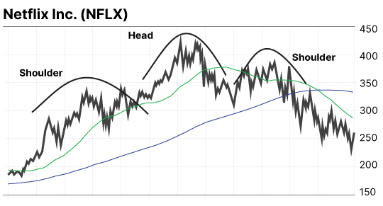
This chart of Netflix Inc. (NFLX) from 2008 gives you a good idea of how the chart pattern typically plays out. Can you see the humps that make up the head and shoulders?
A head and shoulders pattern can predict a selloff because of what's happening behind the scenes for investors and traders.
Popular stocks like NFLX often move up and down as investors buy and sell. And as long as each "up" is higher than the last one and each "down" bottoms out before the pullback gets too deep, everyone's generally happy.
But when a stock pulls back and the next "up" doesn't make a new high... and then when that same stock falls below its last pullback level, it starts getting frightening.
Investors and traders alike realize that this cycle of higher lows and higher highs may be coming to an end. And the breakdown of this pattern can cause a stampede to the exit.
Depending on how popular the stock is, there could be weeks of selling before skittish investors finally finish unloading their shares.
You don't want to be holding a short-term trading position through that selloff.
So in today's more volatile market, keep an eye out for head and shoulders patterns with stocks that you're holding.
The "Death Cross" Signal Can Help you Escape
Another well-known pattern is called the "death cross." It occurs when a short-term moving average line crosses below a longer-term moving average line.
Take a look at this chart and I'll explain how the pieces fit together.
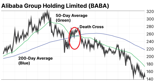
In this chart of Chinese Media company Alibaba Group (BABA), you can see the 200-day average (the blue line) and the 50-day average (green line)
These lines calculate the average price for the previous 200 or 50 days. The lines can help determine the general long-term or short-term trend for stocks.
Many traders use different moving averages. So if you look at charts from other people, you may see a 20-day line, a 10-day line or some other time frame.
Since I'm less of a day trader and focus more on long-term charts, I've found the 50 and 200-day lines most helpful.
A death cross happens when the short-term line passes below the long-term line. This is just a signal that the overall trend for the stock has changed.
As you can see in the chart of BABA above, this change in trend was followed by a severe selloff in the stock!
Again, these patterns aren't magic. But they do give us a more mathematical view of how a trend is shifting.
This can be a lot more helpful than making a decision based on your emotions. If the death cross has occurred, you may want to go ahead and sell part (or maybe all) of your position.
But if the short-term average is still above the longer-term line, you might consider holding for a rebound.
Hopefully, these chart patterns can give you a better idea of when to sell and when to hang on to your favorite stocks.
I'd love to hear what you think! If you find these chart patterns helpful, let me know. I've got a couple positive patterns I'd like to share with you next time.
Please send me an email and let me know what you think.
Here's to living a Rich Retirement!

Zach Scheidt
Editor, Rich Retirement Letter
RichRetirementFeedback@StPaulResearch.com

How Others’ Incompetence Costs You Big-Time
Posted January 17, 2024
By Byron King

Turning Empty Cubicles Into Houses
Posted January 15, 2024
By Zach Scheidt

"Boring AI": Overlooked Opportunity From CES 2024
Posted January 12, 2024
By Zach Scheidt

5 Must-See Predictions
Posted January 10, 2024
By James Altucher

Welcome to Earth, the Mining Planet
Posted January 08, 2024
By Byron King